The setup

What I wanted to find out

I live in London, and I wanted a concrete answer to a simple question: if you want to bike somewhere here, how likely is it that there's decent cycling infrastructure near you — and where in the city is there nothing?

"Bikeable" can mean a lot of things, so I pinned it down: walking-distance access to comfortable cycling infrastructure. A separated track counts for more than a painted line on a busy road, so I treated them differently instead of lumping all "bike infrastructure" together.

The data came from the City of London Open Data portal. Two cycling layers did the work: 300 on-street facilities (lanes, separated tracks, signed routes) and 2,482 off-street multi-use paths, mostly in parks.

A judgment call along the way

My first plan was a Level of Traffic Stress (LTS) analysis, which rates each street by how stressful it is to ride. But LTS needs speed-limit, lane-count, and road-class data on every road, and London's published road layer doesn't carry those fields, so it wasn't possible here. Rather than force it, I switched to a method the available data could actually support.

Working out that the data couldn't answer the question the way I'd first planned, before I'd sunk much time into it, was one of the more useful habits I picked up here.

Methodology

How I classified it — Can-BICS

I used Can-BICS — the Canadian Bikeway Comfort and Safety classification system (Winters, Zanotto & Butler, 2020), the Statistics Canada national standard for naming cycling infrastructure. Using the national standard matters: it means my classification lines up with how London gets measured nationally, instead of being something I made up. It sorts facilities into three comfort classes, plus a category for things that don't meet the bar.

Comfort classification

Class What it is Comfortable for
High Separated cycle tracks, bike-only paths Most people (all ages & abilities)
Medium Paved multi-use paths Some people
Low Painted bike lanes on busy roads Few people
Non-conforming Sharrows, signed routes, walking trails Doesn't meet the comfort bar

Then the access question. A bike route is drawn as a line, and a line has no width, so on its own it can't tell you how much of the city is near a route. So I drew a band around each route (a "buffer"), sized to how comfortable the route is. A genuinely comfortable route is worth walking a bit further for.

Access buffers

Class Buffer Why
High 500 m Williams et al. 2023 — a Canadian study on this kind of infrastructure
Medium 400 m NACTO neighbourhood-spacing guidance (~¼ mile)
Low 200 m A painted lane on a busy road doesn't earn a big band
Non-conforming none Doesn't count as comfortable access

I combined all the bands into one "anywhere you can reach a facility" shape and subtracted it from the city. What's left over is the gap. I ran the whole thing in ArcGIS Pro.

What I found

55%

of London's land has no walking-distance access to any comfortable cycling facility.

The gap is almost entirely the suburban edges and the rural fringe; the access that exists clusters in the centre and inner neighbourhoods. The more telling number shows up when you ask what kind of access it is:

24% on-street infrastructure only
45% including park paths

Roughly 20 points of London's measured cycling access is recreational park pathway — great for a weekend ride, but not a connected network that gets you to work.

The gap, mapped

Red is everywhere more than a short walk from a comfortable cycling facility. The access bands cluster in the centre; the outer ring is almost all gap.
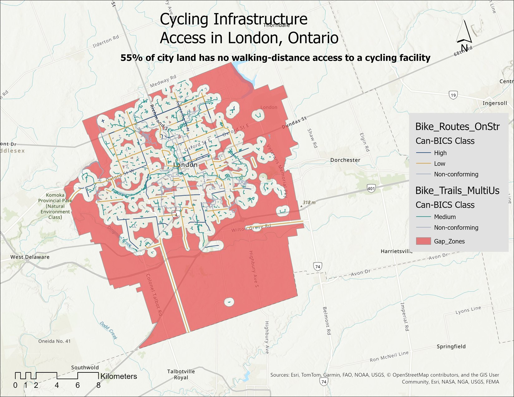
Map of cycling-infrastructure access across London, Ontario. The gap is shown in red across the suburban edges and rural fringe; access clusters in the urban core and inner neighbourhoods.
Fig. 01 — The gapLondon's cycling access, mapped; the red gap is 55% of the city. (Legend labels get a cleaner re-export from ArcGIS.)

This lines up with something the research already noted but couldn't fully explain. Winters et al. (2022) found that in London, the amount of cycling infrastructure barely predicts how many people bike to work — which is unusual for a Canadian city. One suggested reason: a lot of London's network is recreational (the Thames Valley Parkway and similar) and doesn't connect to where people work. My result shows that mechanism directly: a big share of what counts as cycling "access" in London is recreational pathway, not commuter routes.
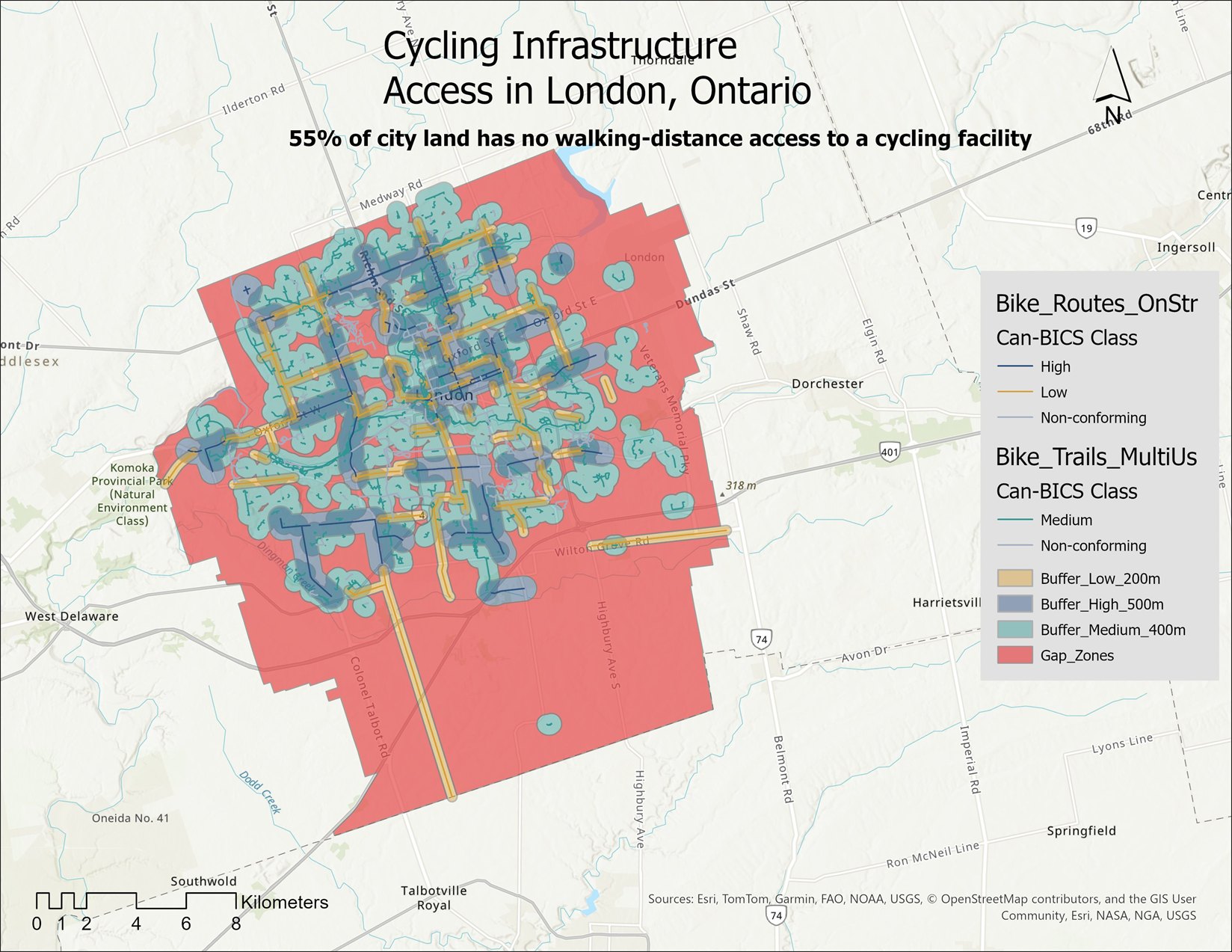
Full analysis map of London, Ontario — cycling network by Can-BICS comfort class, the access buffers around each route, and the resulting gap zones, shown together.
Fig. 02 — The full pictureComfort classes, the access bands around each route, and the gap, all on one map. (Legend labels get a cleaner re-export from ArcGIS.)
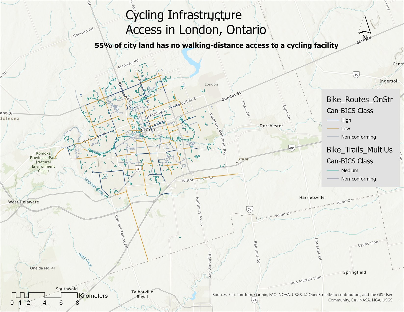
Map of London, Ontario's cycling network on its own, with each route coloured by its Can-BICS comfort class — high, medium, low, and non-conforming.
Fig. 03 — The bare networkThe cycling network on its own, coloured by Can-BICS comfort class. (Legend labels get a cleaner re-export from ArcGIS.)

Limitations

Where this could be wrong

I'd rather be upfront about the soft spots than oversell this.

Phase 2

Three lenses, each its own study

Phase 1 is the foundation — what exists, and where the gaps are. Three studies build on it, and any one of them could turn out to be a bigger finding than the map that made it possible. They're independent, so they can happen in any order.

Lens 01 · Equity

Who do the gaps actually affect?

Lay Census population and a deprivation index — the national CIMD, or Ontario's ON-Marg — over the gap zones. If the places with no comfortable access turn out to be the city's lower-income or more marginalized neighbourhoods, the gap stops being a map problem and becomes an equity one.

Lens 02 · Safety

Does comfortable infrastructure actually prevent crashes?

Bring in London's bicycle-collision records and test them against the comfort classes. A 2022 Western thesis found the city's bike lanes linked to fewer collisions but couldn't tell the lane types apart — and named that as the open question. The Can-BICS classification here is the missing variable, so this lens could show which comfort classes actually reduce crashes.

Lens 03 · Evolution

How did this network actually grow?

The data carries install and rehabilitation years. Filtering by them rebuilds the network at any past date — so this lens can show when each comfort class first appeared in London, and whether the comfortable end has been catching up or falling behind.

Sources

References & method notes

Cycling infrastructure classified to Can-BICS · spatial analysis in ArcGIS Pro · projection NAD 1983 UTM Zone 17N.